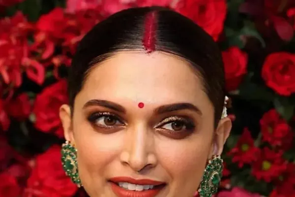
You have almost certainly owned two garments in similar styles where one looked excellent and the other did nothing for you. Frequently the problem is not the garment. It is the color.
The colors you wear should complement your skin tone, and the rule applies to make-up and hair color as much as to clothing. What looks superb on darker skin can look washed out on fair skin, and the wrong choice can flatten a dusky complexion entirely.
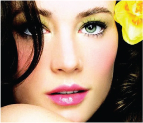
Why skin tone varies
Human skin ranges from almost black to nearly colorless, and the difference comes down to the amount and type of melanin pigment present. Sun exposure increases melanin, but the underlying variation is largely genetic. Ancestry in tropical regions produces darker skin through greater sunlight exposure over generations; subtropical ancestry produces fairer skin.
How to identify your skin tone
Every complexion falls into one of three categories, and there is a simple test.
Look at the veins on your inner wrist. More green veins than blue indicates a warm tone. More blue veins than green indicates a cool tone. It takes five seconds and it is the most reliable quick check there is.
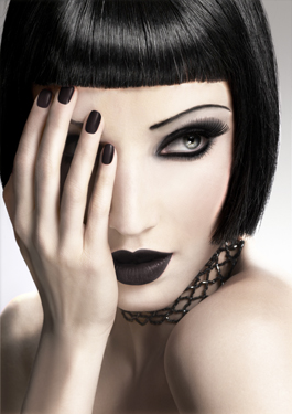
Warm
Yellow or golden undertones, with more green veins than blue on the inner wrist. Colors with a warm overtone look natural on you.
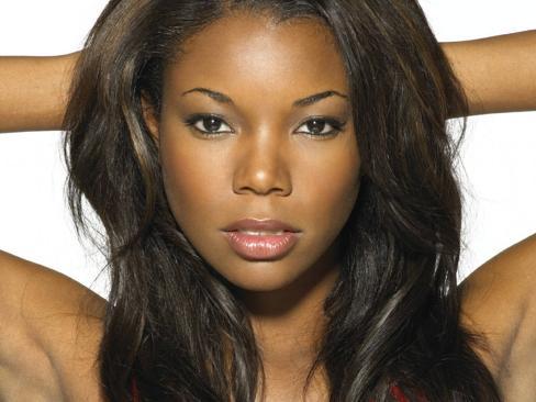
Medium
Between warm and cool, and generally described as wheatish. Medium tones sit considerably closer to warm than to cool, and there are many variations depending on the pigment mix. Rich, warm and spicy colors look natural on you.
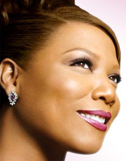
Cool
Blue or pink undertones, with more blue veins than green. The most common variation is fair skin with pink blushing cheeks. Colors with a cool overtone look natural on you.

Warm skin tone
Outfit colors
Warm tones call for intense, fiery shades. Choose deep colors such as purple, deep pink, blue-green and burgundy. Lavender, soft neutrals and pastels also flatter.
Colors to avoid
- White, beige and cream. The contrast against warm skin is so extreme that it is unflattering.
- Very dark shades on dark skin, which fail to stand out.
- Diluted shades: reds with an orange tinge, rustic golds and mossy greens.

Make-up
- Foundation. Yellow-base undertones.
- Powder. Yellow-base undertones, loose so it applies evenly.
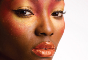
- Blush. Auburn or rich bronze. Bolder colors on darker skin produce a natural glow.
- Lipstick. On darker skin, rose, magenta and shades of purple.
- Eyeshadow. Bronze, cream, light brown, red and pink, soft green and coral.
Hair color
Hair colors with a warm overtone look natural on you.
Medium skin tone
Outfit colors
Look for rich, warm and spicy shades. Orange, mustard, pink, red and blue tones all work well.
Colors to avoid
- Icy silver, bright blue and shocking pink. Sharp icy colors make a medium brown complexion appear harsh.
- Colors matching your own skin, such as caramel and brown, which leave nothing to contrast against.

Make-up
- Foundation. A yellow base, matched as closely as possible across the olive to tanned range.
- Powder. Yellow-base undertones.
- Blush. For olive to yellow skin, copper, almond and warm brown. For tanned skin, peach, coral, apricot and orange.
- Lipstick. Brown, warm red or very pale on yellow skin. Tanned skin suits a range of true pinks.
- Eyeshadow. Earthy hues add dimension. Scarlet red, earthy brown and olive green all work.
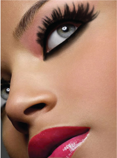
Cool skin tone
Outfit colors
Cool tones suit bright, cool colorings. Choose true red, icy aqua, bright pink, black and gray.
Colors to avoid
Muted yellow-based colors. Whites, pastels and golds make cool skin appear pale.

Make-up
- Foundation. Blue or pink undertones.
- Powder. Blue or pink undertones.
- Blush. Pink, tawny and beige.
- Lipstick. On very light skin, pinks, orange-reds and light purples. On a fair complexion with a rosy tint, shades of red and pink.
- Eyeshadow. White, silver, pale blue, purple, dark green and gray.
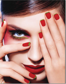
Two techniques that apply to everyone
Testing foundation
Test the color on your face, never on the wrist or the back of the hand, and check it in daylight. Wrist skin is a different color from face skin, and shop lighting is not daylight. This one habit prevents most foundation mismatches.
Testing lipstick
Lipstick is the hardest shade to choose. Before deciding, swatch the tester on a sheet of white paper. That reveals the dominant color underneath, which is frequently not what the shade looks like in the tube.
Quick reference
| Skin tone | Wear | Avoid |
|---|---|---|
| Warm | Purple, deep pink, blue-green, burgundy, lavender, pastels | White, beige, cream, orange-tinged red, rustic gold, mossy green |
| Medium | Orange, mustard, pink, red, blue tones | Icy silver, bright blue, shocking pink, caramel, brown |
| Cool | True red, icy aqua, bright pink, black, gray | Muted yellow bases, white, pastels, gold |
Frequently asked questions
How do I work out my skin tone?
Look at the veins on your inner wrist. More green than blue means warm; more blue than green means cool.
Where should I test foundation?
On your face, in daylight. Wrist and hand skin differ in color from facial skin, and shop lighting misleads.
Why swatch lipstick on white paper?
It reveals the dominant underlying color, which is often different from how the shade appears in the tube.
Why avoid colors that match my skin?
There is no contrast, so the garment and the skin merge and neither stands out.
See also make-up essentials and tools and body types.